Wednesday, 31 December 2014
Wednesday, 17 December 2014
Research and Planning: Analysis of CD album cover- Gabrielle Aplin
Gabrielle Aplin's album keeps the same theme within the front cover, inside cover and back cover:
The title of the album is 'English Rain' in an elegant font which is smaller than the artist's name which is in a different font, as it is written in capital letters which is quite simple and bold. The artist is a British female singer, the cover consists of a dull and grey background which matches to the title of her album 'english rain' as it is mostly dull and rainy in England. She is shown holding an umbrella which is bright and colourful which stands out from the dull and grey background. The genre of this album is folk and pop, therefore it uses a more natural theme for the album.
The inside front cover still follows on from the front cover, showing the same background but her lifting the umbrella in the air, as if she is looking care-free. This could suggest that the dullness could connote the sadness, or the 'bad' things that occur, but there is always a 'good' thing which is present and that the badness can be overcome which could be represented by the umbrella.
The same background is used, so the same theme is kept consistent throughout the covers of the album. The back cover shows the songs of the album which is written in the same font as the title of the album shown on the front cover. It is simple, yet elegant and appealing to the audience. The back cover also shows a barcode, and a small print text below which is information which informs the music publishing company's name, logo, and copyright statement.
Sunday, 14 December 2014
Friday, 12 December 2014
Target Audience
Our chosen target audience for our music video are teenagers and young adults, as I listen to BBC Radio 1, I noticed that this particular radio station plays London Grammar on the radio. BBC Radio 1 is a type of station which specialises in modern and current popular music and including indie music aimed primarily at the 15-29 age group. The genre of our song is indie, which would therefore relate more to a younger audience. Our music video conforms to the conventions of the genre of indie music, as Kitty wore clothes which gave an urban and vintage feel to it.
Thursday, 4 December 2014
Editing: Titles
After importing and positioning the MTV logo, we then added the title of the song at the beginning of our music video. We did this by using Final Cut Pro, which provided a range of choices with the different templates shown. The one which we chose, I found that it was the right choice as it looked professional, smart and worked well with our music video:
The original template consisted of orange coloured text and grey boxes, we found that it did not look right with our black and white theme. So we tried to find a way to the change the colours, and we managed to do just that, We changed the colours to black and white, and we also changed the font so it was clear, simple and bold:
Editing: TV Logo
Once we completed our music video, we had to think in a way as if our music video would be shown on TV, so we had to then put a TV logo on there throughout the whole video. Therefore we chose the MTV logo. Whilst watching previous MTV music videos, we found that the MTV logo was positioned on the top-left corner:

However, the genre of our music video did not fit into any of those categories, so we then chose to choose the original MTV music logo:
We had to find a HD quality picture of an MTV music logo. Whilst looking at the logos, there are different types of logos as there are different MTV channels as it covers different genres of music:

However, the genre of our music video did not fit into any of those categories, so we then chose to choose the original MTV music logo:
It was then imported it into final cut pro across all the footage and positioned in the top-left corner:
Wednesday, 3 December 2014
Editing: Letter box
Most music videos consist of letter boxing, we had to make sure every single frame was the same which had to be 2:35:1. It makes it the picture on the screen and more centred for viewers to clearly watch. So it then looked like this:
Sunday, 30 November 2014
Editing: Tempo Graph
Whilst editing, we were trying to match the sound to the visuals. So our teacher suggested to create a tempo graph, so whilst listening to the song, we marked where the sound changes- either going louder or quieter. We found this helpful and we therefore followed this tempo graph in order to match the sound to the visuals:
Editing: Overlay
As a group we wanted to overlay the smashing of the bottle over another scene, in order to this we had to click on the chosen footage and click overlay:
It then looked like this:
We found that it looked very creative and effective for our music video especially as the colour of the bottle is red, so it the use of the black and white effect of the layer in front enhanced the colour red.
As well as including other overlays:
Research and Planning for edting: Previous A2 music video
Whilst watching this previous A2 music video, I found inspiration from one part of their video. In our music video, we smashed a glass bottle, and in their music video they smashed a bowl with coloured powder paint. They edited it in a way that the smashing of the bowl was layered on top of another scene, which I thought that looked very effective and creative. I showed this part of their music video to my group, and found that one member of my group had also seen that and so we all agreed to try to overlay the smashed bottle with another part of our music video to see what it would look like. We found that the outcome of this was very good, it looked more like a music video and it was different too.
Saturday, 22 November 2014
Editing: Slow motion effect
Certain parts of our music we wanted to have them in slow motion, for example the smashing of the bottle scene, we thought it would look more effective if it were in slow motion, and you would be able to see the individual parts of the bottle when it smashes. Also, whilst watching music videos as part of my research, some music videos had parts in slow motion which matched the pace of the song, we found that ours did that also. We also slowed down the beginning scenes, as the beginning of the song was instrumental and quite slow and calm, so the visuals matched to the song.
As a group we had to use YouTube to see how to do the slow motion effect on Final Cut Pro:
We then wrote down the simple instructions so that we could follow the easy steps to create the effect on certain parts of our music video:
As a group we had to use YouTube to see how to do the slow motion effect on Final Cut Pro:
We then wrote down the simple instructions so that we could follow the easy steps to create the effect on certain parts of our music video:
Editing: Black and white adjustments
We had to adjust the levels of blacks and whites/contrast in each bit of footage as we had to make it bolder and brighter with the whites, In order to this we used colour corrector-3 way so it was colour graded in the correct format which also had to show continuity levels of the black and white effect throughout the whole music video:
Editing: Black and white effect
Whilst researching London Grammar, the reoccurring theme was black and white, so we decided to have our whole music video in black and white. In order to this, we edited our footage on Final Cut Pro by using colour corrector:
Before and after:
Wednesday, 19 November 2014
Editing: Final Cut Pro- folders
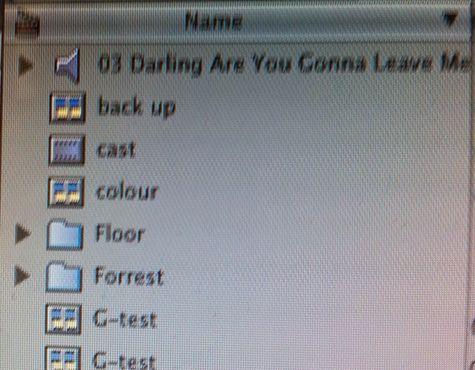
Once all of our footage was on Final Cut Pro, we were able to put the footage into separate folders, therefore it made it easier for us to find a specific clip if we wanted to have it on the timeline, rather than having to look through all the footage. We put the footage into folders under the names of 'floor', 'forest', 'glitter', 'studio', 'subway' :


Editing: Order of the sequence
Some music videos do have a narrative however, it does not follow the same narrative structure as a film does. In a film, the narrative has to have continuity, whereas a music video does not. Whilst trying to put our sequence into an order, we found that we could still repeat a particular part which has already been used previously, as music videos are able to do this, but we did not use too many repeats as it would look to repetitive and it would eventually get boring if we did so. Through the process of editing, we still changed the order of our sequence throughout the process, as we did not have to have a set order, it would change during the editing process as we would have new and different ideas/plan for our music video. We were able to re-arrange our sequence on a timeline in Final Cut Pro:
The timeline showed the seconds so it was easier to identify how long a certain part should be or where it should go. We decided to put the footage into layers as it made it easier to edit, and it made it less complicated as we could edit each section into parts, rather than the whole sequence into one line, and we could create very short cuts which we could split into a number of layers.
Editing: Importing files
We uploaded our footage to Final Cut Pro, but we had to first convert all the files into Apple Pro Res files by using MPEG stream clip. We were then able to drag our footage on the timeline so we could arrange our sequence:
Sunday, 9 November 2014
Filming: Second shoot- added footage/ideas
Before and whilst filming our second footage, we had more ideas to film for our music video. One of our ideas was to use red powder paint, so we thought that we could blow it in the air, it could also be thrown/blown in front of Kitty and having Kitty blow it in the air as well. We found that this looked very effective:
We also decided to have Kitty tearing up a love letter, which connected to the song as the love is broken between her and her love. We used various shots for this, including a close-up shot to show the word love:
We also decided to have Kitty tearing up a love letter, which connected to the song as the love is broken between her and her love. We used various shots for this, including a close-up shot to show the word love:
In our first lot of footage, we filmed her walking down some steps which only showed her boots, so we also filmed her walking on some leaves as it looked effective and it did not show the whole of her so it could also suggest the mood:
Due to the safety risk of smashing glass, we used sugar glass to reduce that risk in our first shoot. However, whilst filming our second footage we decided to smash a glass bottle. We took the safety risks into consideration, and we were able to smash it without anyone getting hurt. We put red food colouring in the bottle to make it look like wine, as wine is a connotation of romance/love, by smashing it, it showed the destruction and brokenness of the love between her and her love:
We then decided to use sparklers in our music video as the sparkler represented the love dying out:
Thursday, 6 November 2014
Filming: Second shoot- subway
Whilst looking through our first lot of footage on final cut pro, we realised that we had to re-shoot certain parts from the subway, due to too much shakiness of the camera and the song was our of sync to her miming of the song. Whilst filming our second footage, we took the time to also film extra parts if needed and other ideas came into the process of filming: powder paint, smashing a glass bottle, sparklers and tearing up love letters/words.
We filmed quite a few 'stills' of her from different angles without any singing, as well as other parts of her singing. This gave a variety of different shots and views, it was effective as well, so it could be used as quick cuts when it came to editing. Kitty also wore a second outfit, a change of outfits are common in music videos, and we did this in our music video. The outfit consisted of a white top with a skirt, still giving an 'edgy' and 'gritty' look to match the mood and tone of the song:

We filmed quite a few 'stills' of her from different angles without any singing, as well as other parts of her singing. This gave a variety of different shots and views, it was effective as well, so it could be used as quick cuts when it came to editing. Kitty also wore a second outfit, a change of outfits are common in music videos, and we did this in our music video. The outfit consisted of a white top with a skirt, still giving an 'edgy' and 'gritty' look to match the mood and tone of the song:

We thought it would be a good idea to film an extreme close-up of her mouth whilst singing the song, this would give a cooler and more effective look for this type of shot used in our video.
Subscribe to:
Comments (Atom)


.JPG)


