Monday, 5 January 2015
Sunday, 4 January 2015
Ancillary task: Alternative CD album cover
Like we did with the magazine advert, by creative alternatives, we were able to experiment and see what one was the most effective. We found that this album cover was not as strong and effective as the other one which we created and therefore chose not to use it as our final album cover.
Ancillary task: Alternative magazine adverts
As a group we decided to create more than one magazine advert as we could have a wider range of ideas and decisions in order to choose or create the final one. We experimented with the image, layout and text and changed them to see what it would like and if it was effective.
Saturday, 3 January 2015
Research and Planning: Typography
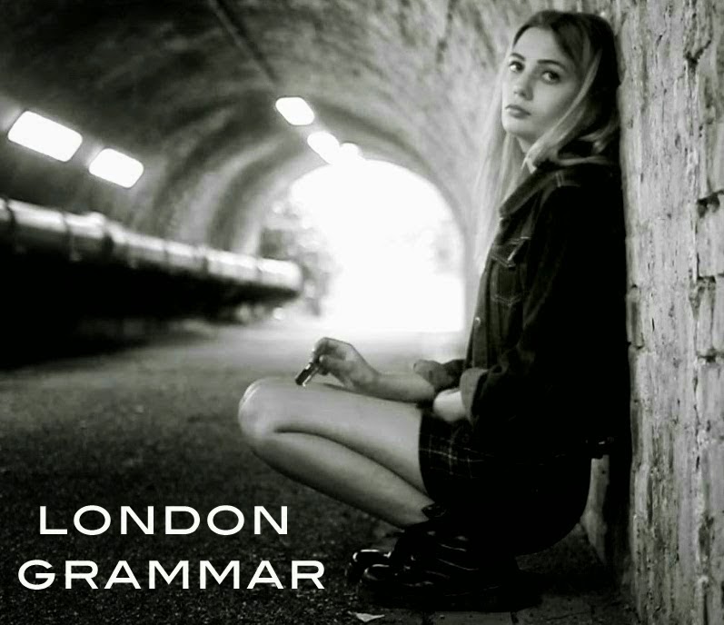
We searched London Grammar's album cover to see what format their text is for the title of their album and so that we would make ours look different to this but as similar theme. The text is white and is written in capital letters, so it is bold, clear and easily read. The two 'M's also overlap with the two 'A's either side, we found that this added a creative and unique touch.
We found that these four formats would be the best choice for the title of the album on our album cover:
- Orator Std
- Blair ITC Light
- Marquisette BTN Lined
- Agency FB
Friday, 2 January 2015
Research and Planning: Inside covers of CD album- Bastille
Typically, the inside cover of an album consists of images which are linked with the artist or follows on from the front and back cover of the CD album which shows a consistent and clear theme. In this case, Bastille's album- 'All this Bad Blood' shows an image on the left hand inside cover of a car with an open door and what looks like blood on the ground. The front cover looks like this:
The front cover shows the car with the door open but from a different angle and view. It shows the same background, so all that changes for the inside cover is the angle and view of the car, the blood on the ground and the lighting is more white. This therefore shows a clear link and story/meaning of the album.
The back cover shows the same location and setting, however, it does not show the car as it is creating the story/meaning of the album but it does show the clear the link through the images by using the same location and theme.
Subscribe to:
Comments (Atom)


